Killian (![[personal profile]](https://www.dreamwidth.org/img/silk/identity/user.png) setsuntamew) wrote in
setsuntamew) wrote in ![[community profile]](https://www.dreamwidth.org/img/silk/identity/community.png) killiansicons2025-01-18 06:57 pm
killiansicons2025-01-18 06:57 pm
Entry tags:
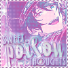
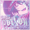
sparkle icon tutorial the second
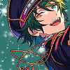
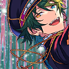
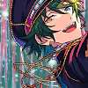
Hi and welcome back once again to my quest to teach everyone how to make icons. This time, we'll be switching gears slightly and learning a different icon style: my beloved sparkle graphics *w* I wrote a tutorial in 2006 for a similar style, but I wanted to make an updated version, with the skillz I've learned over the years~
This is much longer than my past few icon tutorials and more complicated. It was written in Photoshop 2020 and assumes that you are decently comfortable using the software already, because there's a lot going on that will be confusing if you don't already know the basics. I don't know how well it translates to other image editing software, since it makes use of a lot of layer styles that I'm not sure exist elsewhere. Sorry D:

For this style of icon, it's easiest to start with a transparent image, so if yours isn't, you'll want to erase the background before moving forward.
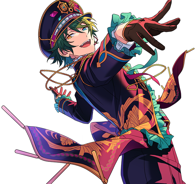
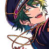
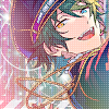
Anyway! I start the way I start most icons: with a blank 100x100 canvas. I pasted the original image in, and then used the Free Transform tool (CTRL+T or ⌘+T) to resize + rotate it until I liked the composition/crop. I usually try to have a vague idea of what I want to do with an icon before starting, but I do tend to move it around a lot until I'm happy with it. After that, I used an Unsharp Mask (Filter > Sharpen > Unsharp Mask...).
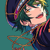
I then created a layer underneath the layer with Mika, chose #327771 as the background color, and used the Paint Bucket to fill it in.
Next up: sparkle central! I used a bunch of brushes from![[livejournal.com profile]](https://www.dreamwidth.org/img/external/lj-community.gif) hgx and peach blush, both of which no longer exist ;w; I still have the download file for the ones I use the most, though please remember to credit hgx for her hard work.
hgx and peach blush, both of which no longer exist ;w; I still have the download file for the ones I use the most, though please remember to credit hgx for her hard work.
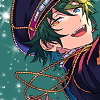
Redistributing 20+ year old resources aside...I created a new layer above the background color and just went to town with sparkles, using white for all of them. The goal here is to fill out the background with sparkles without making it too busy, which can be a hard balance to find. I go until it feels like "enough", which is different for each icon, so I recommend playing around a bunch to get a feel for what you like best.
 →
→  →
→ 
After brushes comes textures! I used this one from![[deviantart.com profile]](https://i.deviantart.net/icons/favicon.png) lookslikerain with the Blend Mode set to Lighten.
lookslikerain with the Blend Mode set to Lighten.
 →
→ 
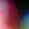
Next, I used this circle light texture (that I've unfortunately lost the credit to), set it to Lighten, and then moved it lower down to be partially behind Mika.
 →
→ 
I used another texture fromlookslikerain, set it to Screen, and moved it up to be around Mika's head.
 →
→ 
I used this brush from![[livejournal.com profile]](https://www.dreamwidth.org/img/external/lj-userinfo.gif) arisubox in white, in the bottom left of the icon.
arisubox in white, in the bottom left of the icon.
 →
→ 
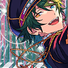
But I decided it didn't stand out enough, so I added a Drop Shadow Layer Style (Layers > Layer Style > Drop Shadow...) to the brush to help it out some. The drop shadow itself is #2b2551, and these are further specifics:

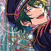
Which then leads to this! :D
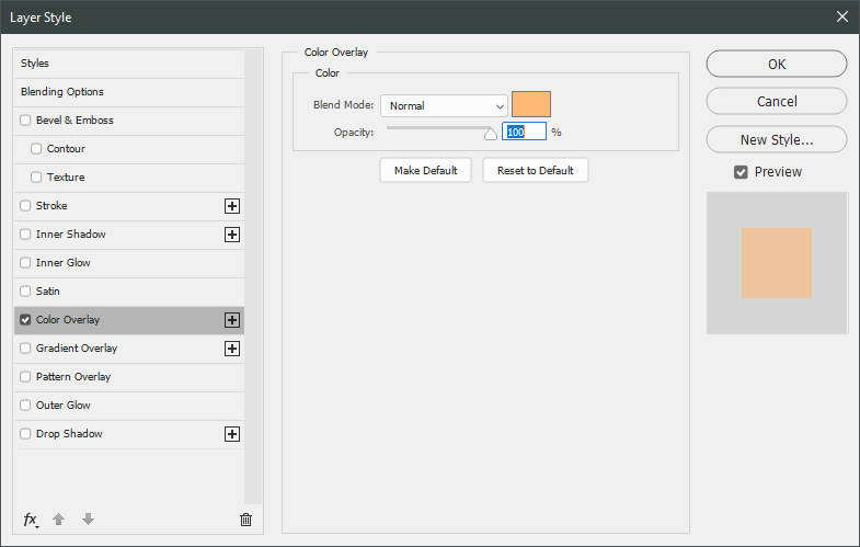
I wanted Mika to stand out a little more, so I decided to give him a drop shadow...but in a different way! I duplicated the layer Mika is on and added a Color Overlay Layer Style (Layers > Layer Style > Color Overlay...) to the original layer, using these settings:
After that, I shifted it a few pixels to the left and set the layer opacity to 60%.

Now, time to start adding some texture/color/etc to the whole thing! Unless otherwise stated, the rest of the textures and brushes will go above Mika. I started with this large texture fromSanami276, set the layer blend mode to Soft Light, and moved it around until I liked how it looked.
 →
→ 
Next up, I used a light texture fromSanami276, set to Lighten.
 →
→ 
And then a brush made by me, in white, with the layer blend mode set to Soft Light and layer opacity set to 70%.
 →
→ 
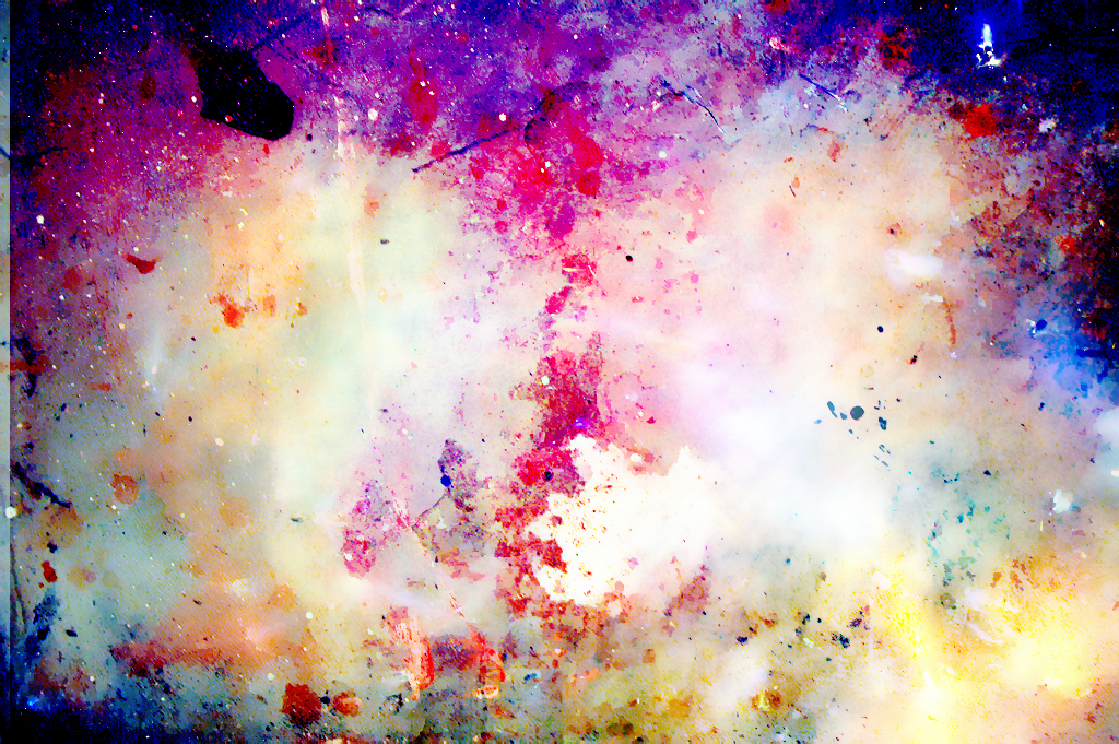
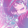
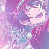
Now for the money shot: the effect that's gonna give it the kinda dreamy blue-purple-pink color scheme~ I used a Gradient Map adjustment layer, and the easiest place to find it is in the Adjustments window.
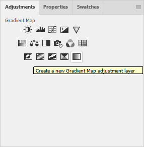
I then used these colors for the gradient itself: #e6388e at 0% and #36b6f2 at 100%.
And then I set the layer blend mode to Lighten.
→ 
After doing that, I decided I wanted to lighten Mika up a little bit. I duplicated the layer he's on and applied a Gaussian Blur (Filter > Blur > Gaussian Blur...) using these settings:
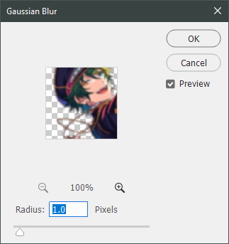
I set the layer to Screen and changed the opacity to 20%.
Now, back to the top- the top layer, that is! I made a new layer, select all (CTRL+A or ⌘+A), and went to Edit > Stroke...
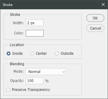
This created a white, 2px border for the icon.

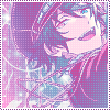
But that's not a very exciting border~ I created another new layer above the 2px white border and used this dotted border brush - made by me! - in #86448a.
 →
→ 
~Text time~ I find there are a few distinctive ways text looks on this style of icon, but this is the one I use the most. Maybe next time I'll teach y'all another one ;D For now, let's get on with it!
Since icons are fairly contained - 100x100 feels a lot smaller than it did when I started out! - text placement is important. I spent a lot of time redoing the size, fonts, and layout of the text in this icon; it gave me quite the headache >< I decided on using part of the lyrics of Meikyuu Denshi Kairou for the text and started with the font Selfish in 44pt and #7fb9c5. I rotated it slightly before doing anything else with it.

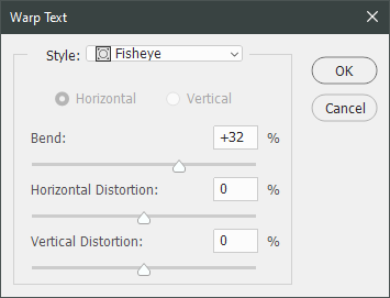
I wanted it to give it a bit more "oomph", so I used one of the warped text effects- specifically, the Fisheye, using these settings.
It looked better, but still pretty plain.
→ 
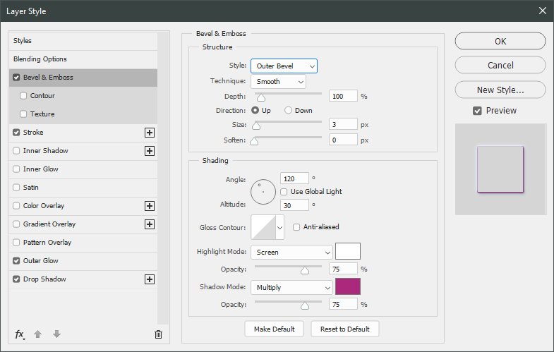
So, time for layer styles!! My favorite way to make text pop. I used a whole bunch of them, starting with Bevel & Emboss (Layer > Layer Style > Bevel & Emboss...) in these settings. The shadow color is #f50e9c, btw.
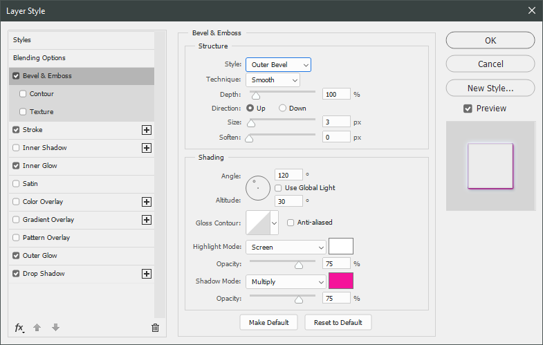
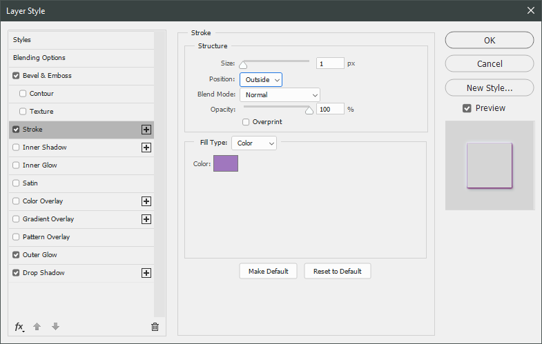
Since I was already in the Layer Style window, I worked my way through all of these before clicking OK. Next up was Stroke in #9d70ba.

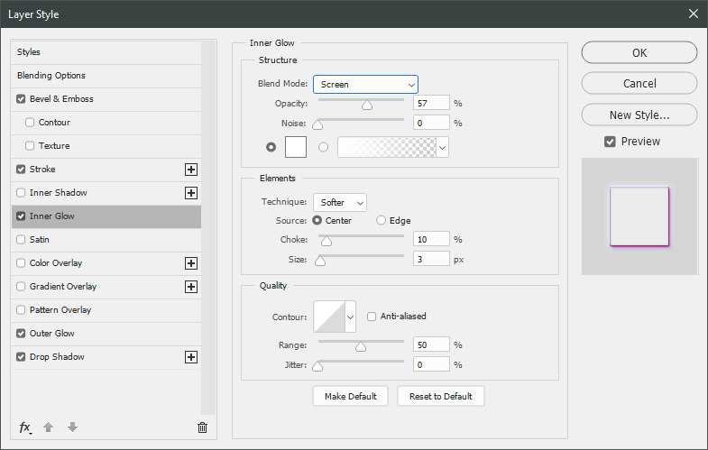
Inner glow, aka a way to add a bit more lightness to the text without being overwhelming.
Outer glow, to help the text stand out a bit more, in #5ca4e7.
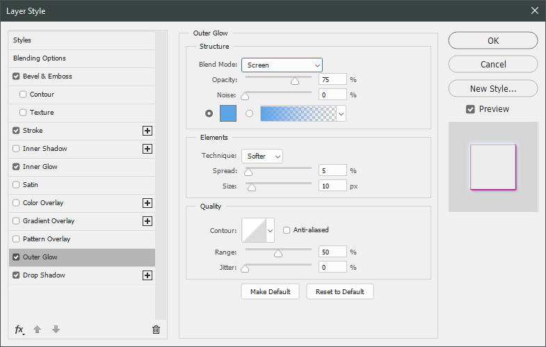
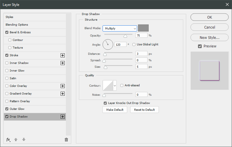
And finally, a light gray drop shadow!

After all these many, seemingly small adjustments, the text looked a lot more exciting. But I still thought it didn't blend in enough, so I set the layer blend mode to Lighten.
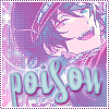 →
→ 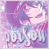
Onwards, to more text! I used PlazaDReg for the smaller text, but each one is a slightly different size and color. "SWEET" is 18pt and #62e5f4 while "THOUGHTS" is 16pt and #dae8fd.
And, once again, I added a bunch of layer styles (though the same for both of them), starting with Bevel & Emboss again. I used #ac287d for the shadow color.
Stroke, in #a077c0.
I didn't use an inner glow for the smaller text, but I did use an outer glow, in #66c2ee.

And another light gray drop shadow to finish it out.
Once again, I liked the layer styles but changed the layer blend mode to Lighten with the opacity set to 90%.
 →
→ 
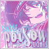
Alright!! Text is done~ It's time to move onto the next exciting part: *animation*
I decided I wanted to add a glow behind Mika's head that would get brighter, so I copy and pasted this light texture fromSanami276 right under the Mika layers. I then set it to Lighten and moved it around to be near his head.
 →
→ 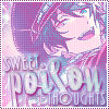
Since I needed a brighter version of the glow, I duplicated the light texture layer, changed the blend mode to Screen, and set the opacity to 70%.
→ 
And with that, I was ready to jump into the animation! First, I opened up the Timeline by going to Window > Timeline and clicked on "Create Frame Animation" so I could actually....make frames.
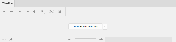
Just a reminder: This is not a tutorial on how to animate in Photoshop. It's meant to teach some basics, but the main goal is to explain how this specific animation is done. I'm gonna try to explain as much as I can, promise! There's just a lot that can be confusing if you're not used to using Photoshop for this sort of thing.
Anyway! At this point, my Timeline looked like this:
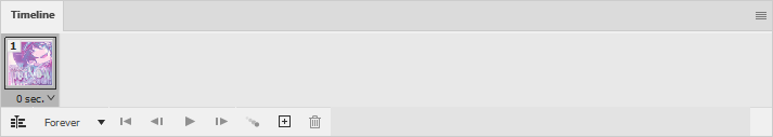
I set the frame delay to 0.1 seconds, which how I usually start icon animations. It's a good speed for in between frames and I can always go in and adjust it later.
Next, I made a new frame using the Duplicate Frame button ( ) and toggled the layer visiblity of the duplicated light texture layer off.

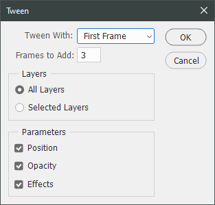
With the two key frames made, it was time to connect them. I used the Tween function ( ) for this task, making sure that the second frame was still selected.
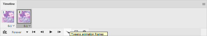
I then tweened it to the Previous frame using these settings:

To make it a full loop, I then tweened that same frame to the First frame, using these settings:
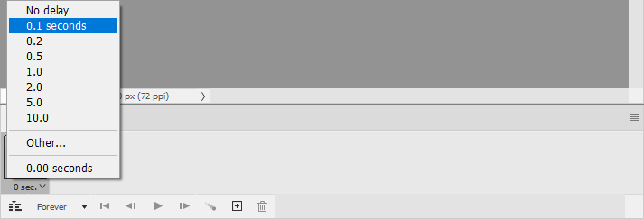
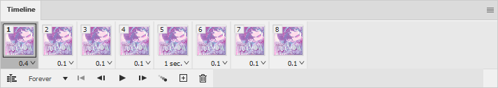
To make it less rushed, I decided to set the two key frames (which are now the 1st and 5th frames) to have longer frame delays. I knew I wanted the less bright frame to last for longer, so I set the 5th frame to 1 second. For the bright one, I wanted it to be slightly less, so I set the 1st frame to 0.4 seconds by choosing the "Other..." option and typing it in.

After that, I played it a few times to make sure I liked it~ This is what my final timeline of frames looked like:
Finally, time to save it as an animated gif! I use Save for Web (File > Export > Save for Web (Legacy)...) for that, which is a feature that I think Adobe has cut from the newest version of Photoshop. I'm still using Photoshop 2020, so it works for me, but your version may not. Since mine does, I'm not sure what the alternative is. I'm sorry D:

I tend to use Save for Web in 2-Up mode, so I can compare the optimized version with the original. I made sure that the file size was under 60kb (the dreamwidth limit) and clicked Save... to save my completed icon.
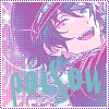
And that's it!!! I know this was a long tutorial, but I tried to be as thorough as possible and a lot of time goes into making icons- for me, at least ;D
If you have any questions, please feel free to ask, and I'll answer as best I can- as long as it's not about making icons in other software D: I only know Photoshop (and Corel PaintShop Pro, but I already know this doesn't fully translate to it). If there are any other icons of mine you're interested in seeing tutorials for - or even just specific techniques! - just lemme know. I love helpin' :D
This is much longer than my past few icon tutorials and more complicated. It was written in Photoshop 2020 and assumes that you are decently comfortable using the software already, because there's a lot going on that will be confusing if you don't already know the basics. I don't know how well it translates to other image editing software, since it makes use of a lot of layer styles that I'm not sure exist elsewhere. Sorry D:
For this style of icon, it's easiest to start with a transparent image, so if yours isn't, you'll want to erase the background before moving forward.
Anyway! I start the way I start most icons: with a blank 100x100 canvas. I pasted the original image in, and then used the Free Transform tool (CTRL+T or ⌘+T) to resize + rotate it until I liked the composition/crop. I usually try to have a vague idea of what I want to do with an icon before starting, but I do tend to move it around a lot until I'm happy with it. After that, I used an Unsharp Mask (Filter > Sharpen > Unsharp Mask...).
I then created a layer underneath the layer with Mika, chose #327771 as the background color, and used the Paint Bucket to fill it in.
Next up: sparkle central! I used a bunch of brushes from
Redistributing 20+ year old resources aside...I created a new layer above the background color and just went to town with sparkles, using white for all of them. The goal here is to fill out the background with sparkles without making it too busy, which can be a hard balance to find. I go until it feels like "enough", which is different for each icon, so I recommend playing around a bunch to get a feel for what you like best.
→ → After brushes comes textures! I used this one from
→ Next, I used this circle light texture (that I've unfortunately lost the credit to), set it to Lighten, and then moved it lower down to be partially behind Mika.
→ I used another texture from
→ I used this brush from
→ But I decided it didn't stand out enough, so I added a Drop Shadow Layer Style (Layers > Layer Style > Drop Shadow...) to the brush to help it out some. The drop shadow itself is #2b2551, and these are further specifics:
Which then leads to this! :D
I wanted Mika to stand out a little more, so I decided to give him a drop shadow...but in a different way! I duplicated the layer Mika is on and added a Color Overlay Layer Style (Layers > Layer Style > Color Overlay...) to the original layer, using these settings:
After that, I shifted it a few pixels to the left and set the layer opacity to 60%.
Now, time to start adding some texture/color/etc to the whole thing! Unless otherwise stated, the rest of the textures and brushes will go above Mika. I started with this large texture from
→ Next up, I used a light texture from
→ And then a brush made by me, in white, with the layer blend mode set to Soft Light and layer opacity set to 70%.
→ Now for the money shot: the effect that's gonna give it the kinda dreamy blue-purple-pink color scheme~ I used a Gradient Map adjustment layer, and the easiest place to find it is in the Adjustments window.
I then used these colors for the gradient itself: #e6388e at 0% and #36b6f2 at 100%.
And then I set the layer blend mode to Lighten.
→ After doing that, I decided I wanted to lighten Mika up a little bit. I duplicated the layer he's on and applied a Gaussian Blur (Filter > Blur > Gaussian Blur...) using these settings:
I set the layer to Screen and changed the opacity to 20%.
Now, back to the top- the top layer, that is! I made a new layer, select all (CTRL+A or ⌘+A), and went to Edit > Stroke...
This created a white, 2px border for the icon.
But that's not a very exciting border~ I created another new layer above the 2px white border and used this dotted border brush - made by me! - in #86448a.
→ ~Text time~ I find there are a few distinctive ways text looks on this style of icon, but this is the one I use the most. Maybe next time I'll teach y'all another one ;D For now, let's get on with it!
Since icons are fairly contained - 100x100 feels a lot smaller than it did when I started out! - text placement is important. I spent a lot of time redoing the size, fonts, and layout of the text in this icon; it gave me quite the headache >< I decided on using part of the lyrics of Meikyuu Denshi Kairou for the text and started with the font Selfish in 44pt and #7fb9c5. I rotated it slightly before doing anything else with it.
I wanted it to give it a bit more "oomph", so I used one of the warped text effects- specifically, the Fisheye, using these settings.
It looked better, but still pretty plain.
→ So, time for layer styles!! My favorite way to make text pop. I used a whole bunch of them, starting with Bevel & Emboss (Layer > Layer Style > Bevel & Emboss...) in these settings. The shadow color is #f50e9c, btw.
Since I was already in the Layer Style window, I worked my way through all of these before clicking OK. Next up was Stroke in #9d70ba.
Inner glow, aka a way to add a bit more lightness to the text without being overwhelming.
Outer glow, to help the text stand out a bit more, in #5ca4e7.
And finally, a light gray drop shadow!
After all these many, seemingly small adjustments, the text looked a lot more exciting. But I still thought it didn't blend in enough, so I set the layer blend mode to Lighten.
→ Onwards, to more text! I used PlazaDReg for the smaller text, but each one is a slightly different size and color. "SWEET" is 18pt and #62e5f4 while "THOUGHTS" is 16pt and #dae8fd.
And, once again, I added a bunch of layer styles (though the same for both of them), starting with Bevel & Emboss again. I used #ac287d for the shadow color.
Stroke, in #a077c0.
I didn't use an inner glow for the smaller text, but I did use an outer glow, in #66c2ee.
And another light gray drop shadow to finish it out.
Once again, I liked the layer styles but changed the layer blend mode to Lighten with the opacity set to 90%.
→ Alright!! Text is done~ It's time to move onto the next exciting part: *animation*
I decided I wanted to add a glow behind Mika's head that would get brighter, so I copy and pasted this light texture from
→ Since I needed a brighter version of the glow, I duplicated the light texture layer, changed the blend mode to Screen, and set the opacity to 70%.
→ And with that, I was ready to jump into the animation! First, I opened up the Timeline by going to Window > Timeline and clicked on "Create Frame Animation" so I could actually....make frames.
Just a reminder: This is not a tutorial on how to animate in Photoshop. It's meant to teach some basics, but the main goal is to explain how this specific animation is done. I'm gonna try to explain as much as I can, promise! There's just a lot that can be confusing if you're not used to using Photoshop for this sort of thing.
Anyway! At this point, my Timeline looked like this:
I set the frame delay to 0.1 seconds, which how I usually start icon animations. It's a good speed for in between frames and I can always go in and adjust it later.
Next, I made a new frame using the Duplicate Frame button (
) and toggled the layer visiblity of the duplicated light texture layer off.With the two key frames made, it was time to connect them. I used the Tween function (
) for this task, making sure that the second frame was still selected.I then tweened it to the Previous frame using these settings:
To make it a full loop, I then tweened that same frame to the First frame, using these settings:
To make it less rushed, I decided to set the two key frames (which are now the 1st and 5th frames) to have longer frame delays. I knew I wanted the less bright frame to last for longer, so I set the 5th frame to 1 second. For the bright one, I wanted it to be slightly less, so I set the 1st frame to 0.4 seconds by choosing the "Other..." option and typing it in.
After that, I played it a few times to make sure I liked it~ This is what my final timeline of frames looked like:
Finally, time to save it as an animated gif! I use Save for Web (File > Export > Save for Web (Legacy)...) for that, which is a feature that I think Adobe has cut from the newest version of Photoshop. I'm still using Photoshop 2020, so it works for me, but your version may not. Since mine does, I'm not sure what the alternative is. I'm sorry D:
I tend to use Save for Web in 2-Up mode, so I can compare the optimized version with the original. I made sure that the file size was under 60kb (the dreamwidth limit) and clicked Save... to save my completed icon.
And that's it!!! I know this was a long tutorial, but I tried to be as thorough as possible and a lot of time goes into making icons- for me, at least ;D
If you have any questions, please feel free to ask, and I'll answer as best I can- as long as it's not about making icons in other software D: I only know Photoshop (and Corel PaintShop Pro, but I already know this doesn't fully translate to it). If there are any other icons of mine you're interested in seeing tutorials for - or even just specific techniques! - just lemme know. I love helpin' :D
no subject
And same, I only know Corel PaintShop Pro. So totally new to photoshop. I wish copy and pasting a new image was as simple as Corel made it.
no subject
I actually started in PaintShop Pro, so switching over was super confusing. In Photoshop, you have to select the whole image you want to copy first (by using CTRL+A) and then you can paste it in a new image. I have no idea why exactly they do it that way, but it took me forever to figure out >
no subject
no subject
no subject
no subject
no subject
no subject
You're so welcome, btw! Thank you for sharing what you made!!!
no subject
no subject
no subject
no subject
Also real talk, being in smaller/niche fandoms is a big part of why I got into icon making in the first place and why I keep doing it. I wish you good luck with all your graphics editing endeavors!!!