Killian (![[personal profile]](https://www.dreamwidth.org/img/silk/identity/user.png) setsuntamew) wrote in
setsuntamew) wrote in ![[community profile]](https://www.dreamwidth.org/img/silk/identity/community.png) killiansicons2024-10-11 06:34 pm
killiansicons2024-10-11 06:34 pm
Entry tags:
another icon tutorial
Hello and welcome to "Killian writes an icon tutorial for the first time since 2010", aka an excuse to procrastinate working on my wig for a con this weekend (so basically, not a lot has changed).
Made in Photoshop 2020, but you can probably recreate it in as far back as CS2-ish (since I still use the same sort of techniques I've been using since then, lmao). Not sure how well it translates to other graphics software, sorry! Adobe has me in a death grip.


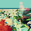
I basically always start with a blank 100x100 canvas and paste the image into it. I try to go into icon making with a vague idea of what I want to do, and I knew from the beginning that my vision for this icon would have the top 1/4-1/3 of the image covered by a solid band of color. To make positioning the image of Hiiro easier, I made a rough version of the band with temporary colors (though they're pretty close to what I ended up using in the end).

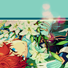
With that in place, I could start working with the actual image for the icon. After pasting it in and adjusting the layers so it was under the band, I resized it and moved it around a bunch until I was happy with the position. Once I liked how it looked, I used an Unsharp Mask on the base.

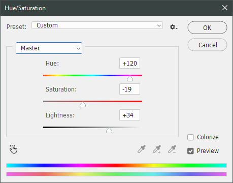
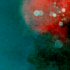
Next up, I used a texture from![[deviantart.com profile]](https://i.deviantart.net/icons/favicon.png) lookslikerain. However, purple is all wrong for the color scheme I had in mind, so I went to Image > Adjustments > Hue/Saturation... to change it up to better suit my needs. Never be afraid to mess around with textures!
lookslikerain. However, purple is all wrong for the color scheme I had in mind, so I went to Image > Adjustments > Hue/Saturation... to change it up to better suit my needs. Never be afraid to mess around with textures!
 →
→ 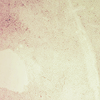
Here's how I adjusted this specific texture, but each one is unique- both the texture and the icon you're creating, so it's best to play with it until you get good results.
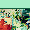
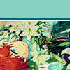
I then pasted this into the icon, making sure it was under the layers making up the top bands of color (because I was only trying to affect the base for now), and set this layer to Darken.
→ 
Now it's time to mess with the colors of the top band. They sorta matched before I did anything to the base, but now...not quite. I used a layer style for each part of it, but using the paint bucket tool would work just as well. I went to Layer > Layer Styles > Color Overlay... for each, changing the colors as necessary. The thickest band is #85d0bf, the middle band is #086371, and the thinnest, lightest one is #fcfcd8.
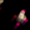
Time to start putting stuff on top of everything!! I took this light texture fromianthinae, rotated it, and set it to Lighten. I decided I wanted it to be a little bit brighter, so I duplicated the layer, set it to Screen, and dropped the Opacity to 20%.
 →
→  →
→ 
I then used a texture fromSarah-Dipity and set it to Lighten as well.
 →
→ 
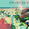
Okay, now that's what I'm talkin' about!!! It's time to throw some text on this~ I went for something simple to go with the theme of the story this card is from: Princely. The font is Georgia, 10pt, in #086371, set to all caps. I decided it didn't stand out enough, so I duplicated it, changed the color to #8b4235, dragged it under the first text layer, and moved it 1 pixel to the right.
 →
→ 
I wanted a bit more embellishment around it, so I used this simple tiny text brush fromcolorfilter in #06444d. I also erased part of it to make it fit the space better.
 →
→ 
Finally, I used a texture fromshiruji, set to Darken to get a bit more color variation in it, and called it done! :D
 →
→
If you have any questions, please feel free to ask, and I'll answer as best I can- as long as it's not about making icons in other software D: I only know Photoshop (and Paint Shop Pro, but I don't think anyone uses that anymore). If there are any other icons of mine you're interested in seeing tutorials for - or even just specific techniques! - just lemme know. I love helping :D
Made in Photoshop 2020, but you can probably recreate it in as far back as CS2-ish (since I still use the same sort of techniques I've been using since then, lmao). Not sure how well it translates to other graphics software, sorry! Adobe has me in a death grip.
I basically always start with a blank 100x100 canvas and paste the image into it. I try to go into icon making with a vague idea of what I want to do, and I knew from the beginning that my vision for this icon would have the top 1/4-1/3 of the image covered by a solid band of color. To make positioning the image of Hiiro easier, I made a rough version of the band with temporary colors (though they're pretty close to what I ended up using in the end).
With that in place, I could start working with the actual image for the icon. After pasting it in and adjusting the layers so it was under the band, I resized it and moved it around a bunch until I was happy with the position. Once I liked how it looked, I used an Unsharp Mask on the base.
Next up, I used a texture from
→ Here's how I adjusted this specific texture, but each one is unique- both the texture and the icon you're creating, so it's best to play with it until you get good results.
I then pasted this into the icon, making sure it was under the layers making up the top bands of color (because I was only trying to affect the base for now), and set this layer to Darken.
→ Now it's time to mess with the colors of the top band. They sorta matched before I did anything to the base, but now...not quite. I used a layer style for each part of it, but using the paint bucket tool would work just as well. I went to Layer > Layer Styles > Color Overlay... for each, changing the colors as necessary. The thickest band is #85d0bf, the middle band is #086371, and the thinnest, lightest one is #fcfcd8.
Time to start putting stuff on top of everything!! I took this light texture from
→ → I then used a texture from
→ Okay, now that's what I'm talkin' about!!! It's time to throw some text on this~ I went for something simple to go with the theme of the story this card is from: Princely. The font is Georgia, 10pt, in #086371, set to all caps. I decided it didn't stand out enough, so I duplicated it, changed the color to #8b4235, dragged it under the first text layer, and moved it 1 pixel to the right.
→ I wanted a bit more embellishment around it, so I used this simple tiny text brush from
→ Finally, I used a texture from
→ If you have any questions, please feel free to ask, and I'll answer as best I can- as long as it's not about making icons in other software D: I only know Photoshop (and Paint Shop Pro, but I don't think anyone uses that anymore). If there are any other icons of mine you're interested in seeing tutorials for - or even just specific techniques! - just lemme know. I love helping :D
no subject